Update 6/12/2013
I have made a jQuery plugin based off of this blog post that allows for rapid prototyping of 2 or 3 column layouts by simply adding classes to a div structure. This plugin is cross browser compatible, fully responsive, and fully HTML5 compliant. If you’d like to get on your way to creating fully responsive 2, 3, 4, 6, or even 8 column layouts, go download “jQuery Easy Columns” from our plugin page.
/Update
For those of you that are like me, you insist on writing all code by hand without the assistance of any CSS or JS wireframing tools. For those of us that code by hand, finding effective solutions to problems that arise is part of the reward behind completing a site. One problem that I frequented over the course of my learning was a solution for a dynamic 3 column CSS layout that utilized modern browser standards but still degraded gracefully. After trial and error, I have found what in my opinion is hands down the most elegant way to handle this:
The HTML
<!DOCTYPE html>
<html>
   <head>
      <title>
      Untitled Document
      </title>
      <link rel="stylesheet" type="text/css" href="style.css" />
   </head>
   <body>
      <div id="left"></div>
      <div id="right"></div>
      <div id="middle"></div>
      <br style="clear:both;" />
   </body>
</html>
As you can see, we’ve simply created a fresh document, linked in our stylesheet, and added three divs with the ID’s “left”, “right”, and “middle” (note the order of the divs. It must be this way to work). After the divs, we’ve placed a clearing break to make sure any content below the columns stays below the columns. Now time for the magic…
The CSS
div{
   width:30%;
}

#left{
   float:left;
   margin-left:2%;
}

#middle{
   position:relative;
   left:0px;
   right:0px;
   margin:auto;
}

#right{
   float:right;
   margin-right:2%;
}
The Explanation
Yup, that was it. Pretty easy, huh? The columns created are dynamic, equal width columns, and their height will expand to fit whatever contents you place within. If you require equal height columns, that can be achieved by adding a height property to the <div> styles on the stylesheet. In the HTML, I mentioned that the “right” column must come in flow before the “middle” column. This is due to the nature of floats. If we were to place the middle column before the right column, it would cause the top of the right column to line up with the bottom of the middle column due to the fact that the middle column has not been removed from the flow. By placing the right column prior to the middle, we can call “float:right;” on it in our stylesheet and remove it from the flow, thus allowing the middle column to sit at the same top level as the floated columns. Note that when displayed, the “right” column will still be the right column, despite being in the middle of the HTML flow. The HTML structure is simply a workaround to make the columns line up appropriately. At the very end of our HTML document, we placed a <br /> tag with a clear applied to it in order to cancel the floats of the columns above so that all content past the columns stays below them in the flow. The beautiful part of this layout is that it’s completely valid HTML 5.0 code, yet at the same time it has the exact same result cross browser (I’ve tested back to IE7, not sure about 6). That should be enough reason alone to ditch those other overly convoluted 3 column tutorials for this sustainable method.
The Result
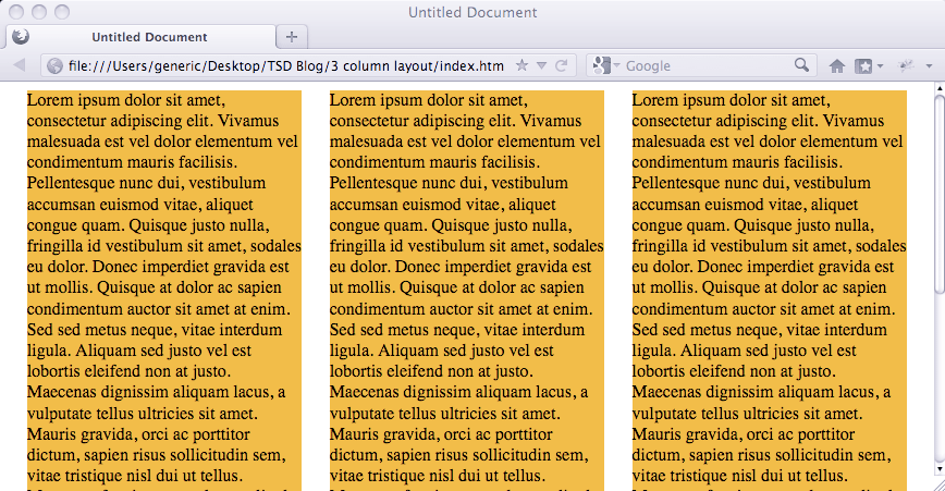
I went to Lipsum.com to grab some dummy text and took the liberty of whipping together a quick demo page. I copied the exact code from above, pasted dummy text in the columns, and added a “background-color:orange;” property to the stylesheet for viewing purposes. Below is what the above code looks like:

Customization
The way it’s currently laid out, the above code will display three equal width columns with moderately sized margins in between. When the screen is resized, the columns will automatically resize to fit the screen. If you need to, you can easily modify the CSS to create columns of different widths, say for a left nav : right ad bar layout. The nice thing about this layout is it’s extremely simple and doesn’t rely on much besides the basic HTML structure and the proper use of floats, so it can be easily adapted to fit your specific purpose. It’s time to drop your table layouts and start rockin’ the floats.
Update 6/12/2013
I have made a jQuery plugin based off of this blog post that allows for rapid prototyping of 2 or 3 column layouts by simply adding classes to a div structure. This plugin is cross browser compliant, fully responsive, and fully HTML5 compliant. If you’d like to get on your way to creating fully responsive 2, 3, 4, 6, or even 8 column layouts, go download “jQuery Easy Columns” from our plugin page.

Comments On This Post
Awesome! Thanks a lot. By any chance could you send me an example of this with a header and a footer? I was studying this example:
http://matthewjamestaylor.com/blog/perfect-3-column.htm
But it is complex compared to your solution. The simpler the better if you ask me! Could you email me example CSS that had a header and footer with margins too?
Also, I did this:
#left{
width:20%;
float:left;
margin-left:2%;
}
#middle{
width:80%;
position:relative;
left:0px;
right:0px;
margin:auto;
}
#right{
width:20%;
float:right;
margin-right:2%;
so that the columns are not the same size (well left and right are thinner, and middle takes up most of the room)
Thanks for your comment! I’ve utilized that solution as well, but I’ve found mine to be much more stripped down and applicable to use in multiple situations. For example, you can actually nest a set of three columns inside of another set. I’ll whip together a quick example of this layout with a header and footer and send it over your way. Thanks for the kind words!