When someone says “brand identity”, people typically think of the main item used to identify a brand: a logo. However, brand identity goes way beyond logo design and your company name. The image and graphic style of your logo needs to be repeated and almost “overused” on everything related to your business. Colors should be unified and determined using specific hex codes or color swatches (I.E. Pantone). The whole point of brand identity is to create a memorable and unique image for your business that customers can use to identify you in a crowd. For example, you don’t need to see the name “Starbucks” with their logo to recognize the coffee giant. They’ve created an outstanding, cohesive brand identity that allows their logo to stand on its own on all of their marketing material.
In this blog post I’m going to cover the 5 key elements that help make a brand identity successful. Those elements are:
- Good logo design
- Proper use of logo variations
- Color unification
- Consistent graphic style
- Repetition
When all of these elements are present in a company’s marketing and advertising material, a brand identity is established. The more recognizable and unique your brand is, the more likely people are going to be to check out your business or product.
1. Good Logo Design
The key to a successful brand is to start with a good, solid logo. A logo, by definition, is a graphic representation or symbol of a company name. With that said, your logo should be as unique as your business and its name.
A good logo consists of highly recognizable imagery or font choices. Using something unique will not only help you to stand out, but also make your company name recognizable at a glance. Below I have 2 examples, one is a highly recognizable imagery logo, while the other is a unique font based one.

Both of these logos represent highly successful businesses that are easily recognized by their brand alone. Individuality is the main goal of your logo and should be considered when choosing a good designer or picking a design. You should also consider who your target audience is and how they will view your logo’s style. If your company targets children, your logo should be fun, colorful, and highly legible. Kids like bright colors and are more likely to be interested if they can easily read and say your company’s name. On the other hand, if you’re a fortune 500 company, you want your logo to reflect high standards, quality, and professionalism. You won’t be taken very seriously if your logo has a handwritten font and multiple bright colors. Your imagery should also be sleek and clean, not too eccentric or “loud”.
Once you’ve settled on a great logo design, it’s time to apply it to your branding material.
2. Proper Use of Logo Variations
Variations of your logo can add a whole new level of interest to your advertising material. Logo variations can include color changes (within your color scheme, of course), omitting the company name and just using the image, or cropping the logo image to create graphic interest on various materials. One of the most common color variations is a greyscale version of the logo. This version can be used when you need a more subtle instance of the brand identity. The most common use is in the footer of a website.
Omitting the company name from the logo image can be useful in that it forces the viewer to think more about what the symbol means. The viewer is now associating the image with your name whether they notice it or not. When your customers can recognize a symbol that represents your business name, you then have the advantage of conveying your message much faster to them. Instead of taking the time to read the name, your customers are now making an association in their heads, subconsciously. This can, in turn, increase the amount of people that know your business at a glance, thus increasing the return of your brand identity.
Finally, cropping or slightly altering your logo can be a successful way to create an interesting graphic element and make your brand appear more modern. If you look back on the Starbucks example, you see that they use a larger, cropped version of their logo to create a graphic element on their paper bags. The logo is slightly distorted by the fold in the bag, but still recognizable to the customer.

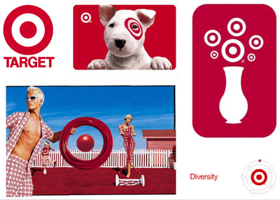
One other great example of using alternate versions of a logo is Target. They use the target symbol and circular shape over and over. A common execution of this is seen in their TV commercials where they will often create the target or circle shape out of objects that you can buy in their stores. I found a good example of one of their commercials like this here. In the image seen below, the target shape is used to “brand” their mascot and also to look like flowers in a vase. This reiterates the logo shape to viewers while creating a fun, interesting element to their advertisements.

3. Color Unification
When it comes to defining your brand identity, color plays a huge role in creating the cohesive look you need to be memorable. Not only should you stick to a color scheme, but you should also make sure that you’re using the exact same colors on every medium. When you pick a color, whether it be from Pantone books or a hex code, stick to that exact color. For example, if your logo has a specific shade of red you should use that shade for all of your branding material. Just because you see “red” as your brand’s color doesn’t mean that you can use any shade of red to represent yourself. Unifying the exact color across your brand will make sure that all of your material matches and looks great in every situation.
When working with print material, proper color management is the most important aspect to keep in mind. Designers should be working with properly calibrated monitors and exporting files in the correct color profile. This will ensure that the digital mock ups you’re shown by your designer will come off the printer looking exactly the same.
4. Consistent Graphic Style
If you’re trying to create a successful brand identity, you need to establish a consistent graphic style and stick to it in all of your advertising and public presentation. When Thought Space first started, we had a distinct graphic style of stitching and banners. When we would create a new piece of advertising material, we would find new ways to incorporate this style while still making the piece look unique and interesting. Once we decided to change the style for the 2014 redesign (by dropping stitched banners), we made sure to change it across the board. When branding your company, you should decide on a basic graphic style to start with. There are so many styles to choose from and more options pop up every day. As design grows and trends change you may have to alter your identity to keep current. However, some graphic styles are considered timeless and can be used almost universally.
Your choice of graphic style can also play a huge part in portraying the right message to your customers. Just like color, graphic styles evoke different emotions and appeal to different groups of people. You should choose a style that appeals to your target audience while still reflecting the goals of your business or product. Keep in mind that just because a design style is popular doesn’t mean that it is right for your specific business. Always try and view it from the perspective of your target audience and, if you can, show examples of it to that demographic and get constructive feedback.
Here we see 2 very distinctly different graphic styles for companies that are both in the clothing industry. One is obviously directed at young women with its funky graphics and whimsical floral elements. The photos have interesting filters applied and quirky graphics to draw your eye all over the page. This style appeals to the target audience of young, hippie-esque women looking for the company’s clothing style and provides a nice compliment to the name “Free People”.
This other example is also for a company in the clothing industry. However, this one is directed at young, professional men. Because of this, the design is much more modern and clean to appeal to the proper audience. The style is consistently carried out across the entire web page and even carries over to the packaging of the product itself.
The chosen style is consistent in every aspect of both companies, from their logo to the packaging and advertising material for their products. This is crucial when trying to establish that memorable, successful brand identity you’re looking for.
5. Repetition
The final, and most important element to a successful brand identity is repetition. In order to establish memorability, a business must plaster their name and likeness all over places that their target audience will see. If you have a nice website that incorporates all of these key elements, then you’re off to a great start. Now you have to find new and interesting ways to reiterate your name and image that will reach the right people. Think outside the box for ways to advertise. There are literally thousands of different mediums you can find that could provide another unique advertising opportunity.
Think of where your audience will spend most of their time. If you’re targeting young adults for a tech based t-shirt company, you’re going to want to advertise online. Your online ads should have at least one instance of your logo and fit with your chosen graphic style. If your ad doesn’t match the website that it’s linked to, your viewers will become confused and possibly leave. The more matching advertisements you have, the more people will see and remember your logo and name. The same concept applies to print material. Find as many outlets as possible to show off your companies brand identity and you’ll soon be on your way to success!
Now that you have the basics for establishing a successful brand identity, take some time to look over your current one. Try to think in terms of someone from your target audience and how they would feel about your company’s image. Don’t have a brand identity established? Thought Space can help with that! If you’re interested in creating a cohesive brand for your business or just need to refresh your current image, feel free to get in touch with us over on our contact page!


No Comments Yet.
Be the first to leave a comment on this article!