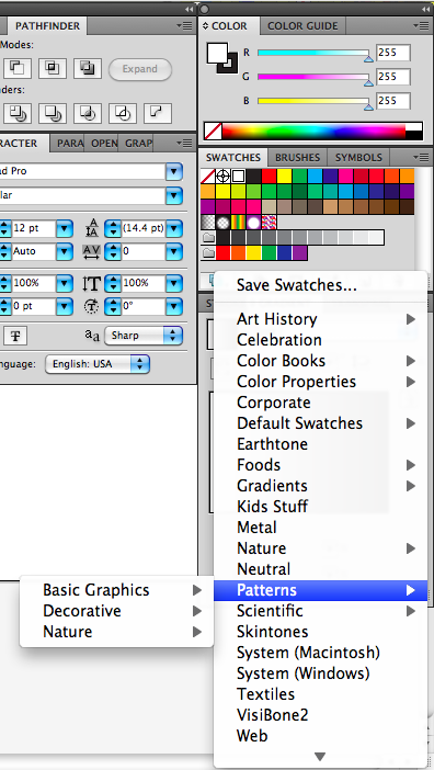
Through all my years of playing around with Adobe Illustrator, I think one of the coolest features I’ve found to date is the pattern swatches. Everyone knows about the basic color swatch palette and the color mixer that allows you to create any color you want on the hexadecimal spectrum. What many people may not know about, however, is the swatch library that exists standard in Illustrator (I use CS5 for Mac). This library offers a huge selection of premixed color swatches categorized into palettes like Earth tones, neutrals, and even a wonderfully useful variety of skin tones. Amongst all of these is also a category labeled “patterns”. This is Illustrator’s default pattern swatch library, and it’s not about to disappoint. The category is broken into 3 main libraries: Basic Graphics, Decorative and Nature. Each of these libraries goes a step deeper to reveal sub categories that include useful patterns like various stripes, polka dots and even half tones. Today I want to show you how to use and manipulate these basic patterns to add interest to your graphics and take them to the next level.
Basics of Pattern Swatches
If you try to just jump in and use a pattern swatch for the first time, you’ll probably be a little disappointed. There are a few things you need to know before you can start manipulating them to your advantage for your project. First of all, you can’t just change the color of a pattern swatch by clicking a color swatch. This is the most important point because many people want to use these patterns in a different color. (Have no fear, I have a couple solutions to this that I will explain later.) Another thing to realize is that the patterns don’t increase in scale. They are one size and, being seamless, will repeat to fill your shape.

Uses For Pattern Swatches
There are many ways that you can use a pattern swatch to make your next design pop. One of the biggest, and probably most important ways to use them is to create texture within a design. There are a variety of patterns available that can help create a sense of texture on your 2D screen such as dots, stripes and decorative patterns. There is also an extensive section of dots that, when layered correctly, form a half tone effect like an old comic book. This is a very effective way to add subtle texture to your graphics that takes them a step above the standard.
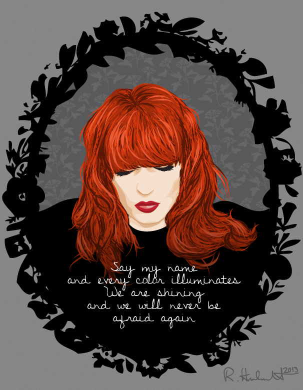
Another great use for pattern swatches is to fill in a background. If you create a vector portrait, for example, and have a large, blank background, your design may not look cohesive. When a solid color isn’t enough to create that finishing touch, try adding a pattern swatch to create that extra subtle interest. On the right, you can see my example where I placed a floral pattern swatch inside the frame to offset it from the rest of the grey background.

Recoloring Pattern Swatches
One of the very first things people want to do with a pattern swatch is recolor it. I can totally understand this and that’s why, now that you know the basics, I’m going to tell you how you can make your pattern swatches the color you want. Start off by coming to terms with the fact that this is not Illustrator’s most versatile tool, and it’s abilities are kind of limited. These swatches are best used for people who A – want to turn out very quick, professional looking work or B – don’t want to (or can’t) go through the pain of making their own background/fill patterns. Trust me, making your own fill patterns can be a hassle. Either way, these swatches need to be colored, so here’s what you need to do:
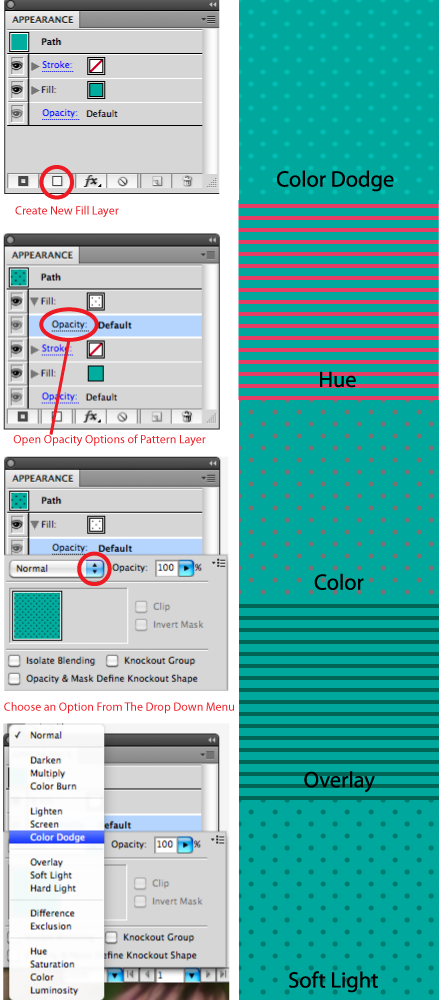
First make a basic shape with a fill color and no outline. Next, create a new fill layer and fill it with a pattern swatch. You should have a solid colored shape with a black pattern over top.
Next, go back to your appearance panel and drop down the attributes for the pattern fill layer. You should see an option for opacity in here. Go ahead and click it. Now you will see opacity options including the percentage and the blending mode. The blending mode is what is going to create magic for these patterns. There’s a drop down list of blending options and each one does something a little different. Note that not every mode will produce a result and some may make your pattern seem to disappear. Don’t fret, just keep your hand on the undo combo (command/control + Z) and experiment. Two of the most useful ones are color burn and color dodge, but feel free to look around and see which ones work best for your project.

Emphasizing Design With Pattern Swatches
Now that you have some ideas on how to use and recolor your pattern swatches, it’s time to play around and see what they can do for you. There are many ways these can be used to make a design better. One example would be to use patterns to fill clothing on illustrations or fashion sketches. There are many pattern swatches that are common patterns in fashion design such as polka dots, animal prints and floral motifs. The pattern won’t wrap around the body, but it will create an implied effect of patterned fabric. You can also use them for quick background texture mock ups on website wireframes, print material layouts and more. The possibilities are endless for what you can do with these patterns in your designs.
Look around for examples of where and how patterns are used in the design media around you. Look at magazine ads and billboards. They usually use patterns and texture to make empty space feel more full. Even if the pattern is merely decorative, it can make all the difference when added to negative space within your work. The more complete and interesting your work looks, the more people will be drawn to it. Besides, the whole point of design is to get people’s attention, right?

Comments On This Post
Thanks, this inspired me to think differently about patterns (:
I created my swatches for a logo that i want to create for my store. I want the background to be burgundy so i have made it like that from the document setup. When i try to make the letters gold with my swatches ,over the burgundy background it seems that the letters are transparent and capture the red in them too. Only on white background i can make the letters bright gold. Any idea how to make the letters be bright god and not transparent over the burgundy background ?
Hi Lory,
Sorry to hear you’re having trouble with your colors! I know issues with Illustrator can be very frustrating. From what I gathered from your comment, there are 2 things I would do to check the problem and try to fix it:
1. Select the letters object so that it’s highlighted, and check the “Fill” for that object under the “Appearance” panel. When you click “Fill” you’ll see a link to the “Opacity” panel. Make sure the opacity for the letters object is set to 100%.
2. If that’s all good and you’re still having issues, then under the same “Opacity” panel, check to make sure the blending mode is set to “Normal”.
These are the first 2 things I would check. Hope this helps!